The front of Colchester castle was easy to do but it took a long time because of the small details. I created a door and the windows by using the extrude tools and creating a multi/sub-object material. I had to keep referring to the guide throughout adding the details because I was very unsure of the size of the windows and the shapes. I was also unsure of where to put the details on the building.
This is the rendered version of the details on the front of the building. I am very pleased with how this look so far. I still think that the door could be improved slightly to make the entrance look more impressive.
This image shows the material I created at this stage. I changed the original brick material into a multi/sub-object material and kept the old material as a sub object. This allowed me to create the other materials which appear on the building and add them as I go along. I created the first couple of material which are, bricks: brick texture, brick edge: grey, roof: light grey, windows: black, wind frame: white. These were applied to individual polygons on the main building.
Monday, 29 November 2010
Saturday, 27 November 2010
Colchester Castle - The Roof
After I had made the basic shape of the castle and applied to material, I wanted to make a big feature of the Castle, which is the roof. This was a lot harder than expected because there were many complicated features on the roof. Firstly I made the curved roof part of the building which was the hardest part. I made this by using a small cylinder and then extending the middle to form the outline. All of the roof parts came from basic shapes and then modified to create the roof effect seen in the rendered images.
These are the rendered images of the finished roof. I am very Happy with the way the roof looks for now, however, i will probably try to change the material of the roof and add a texture.
Wednesday, 24 November 2010
Colchester Castle - The Shape and Material
After I completed Hylands House I did not want to go straight onto cameras and animation because I was unsure of how I could change my initial ideas to make look more interesting. I began to focus on another historical building in Essex, which is Colchester Castle.
According to the Colchester Castle Museum website, Colchester Castle is one of the most historic buildings in the country. During the Roman times, Colchester Castle was a different building known as the Temple of Claudius. This eventually became the main target of the rebels led by Queen Boudica who attacked the Roman town of Colchester in AD 60. In 1076 William I order the royal fortress to be built on the foundations of the Temple and was the largest castle in Europe. For most of its time the Castle was used as a prison. The Castle was opened as a Museum in 1860.
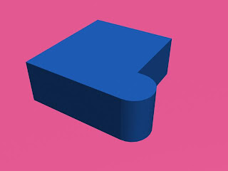
I started building this historic Castle by making the main shape of the building. This was more difficult than it looked as I knew I had to make it just the right shape to fit all the features onto each side of the building. I did this by first creating a box and a cylinder. I cut the cylinder in half and attached it to the side of the building. I then used the welding tool to weld the vertexes together.
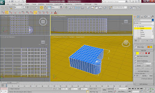
This is a rendered image of the shape of the building so far. It does not look very impressive at this stage.
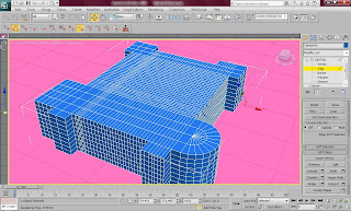
I then extruded many different parts of the building to make the more complex outline of the building and then I added many edges around the building by using the connect tool. This was to ensure that it would be easier to make the windows on the side of the building.
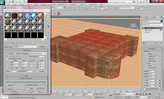
I then applied a material to the shape by finding a picture on the Internet of a textures brick surface and using the UVW Map modifier to place the picture on the poly and tile to picture enough to make the material look effective. I also used a bump map to make the effect of the bricks look 3D and slightly rough instead of a flat texture.
This is what the building looks like after it has the material applied to it in a rendered image. I think this looks very impressive and I am eager to carry on with the rest of the building.
According to the Colchester Castle Museum website, Colchester Castle is one of the most historic buildings in the country. During the Roman times, Colchester Castle was a different building known as the Temple of Claudius. This eventually became the main target of the rebels led by Queen Boudica who attacked the Roman town of Colchester in AD 60. In 1076 William I order the royal fortress to be built on the foundations of the Temple and was the largest castle in Europe. For most of its time the Castle was used as a prison. The Castle was opened as a Museum in 1860.
I started building this historic Castle by making the main shape of the building. This was more difficult than it looked as I knew I had to make it just the right shape to fit all the features onto each side of the building. I did this by first creating a box and a cylinder. I cut the cylinder in half and attached it to the side of the building. I then used the welding tool to weld the vertexes together.
This is a rendered image of the shape of the building so far. It does not look very impressive at this stage.
I then extruded many different parts of the building to make the more complex outline of the building and then I added many edges around the building by using the connect tool. This was to ensure that it would be easier to make the windows on the side of the building.
I then applied a material to the shape by finding a picture on the Internet of a textures brick surface and using the UVW Map modifier to place the picture on the poly and tile to picture enough to make the material look effective. I also used a bump map to make the effect of the bricks look 3D and slightly rough instead of a flat texture.
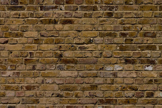
This is what the building looks like after it has the material applied to it in a rendered image. I think this looks very impressive and I am eager to carry on with the rest of the building.
Monday, 22 November 2010
Hylands House - Lighting
For the lighting I wanted to create a natural sunlight effect with shadows so that the trees have effective shadows on the grass and building. For this I used a skylight diagonally facing the scene with the multiplier set to 0.79, while opposite the skylight I set up a target spotlight which was set to 0.6 to make the light look more realistic. I then made sure than the shadows were set to "on" and set on shadow map.
With this lighting the scene clearly looks so much more effective and realistic. It also makes the trees comes to light and seem real. I am very impressed with the work I have created so far. The image below shows the rendered scene.
Hylands House - Finished with Comparison
This is the finished final model of Hylands House. I am very please with house this looks as it looks very effective. There still needs to be some lights added to the scene but I think this model is okay to add to the advert.
The pictures below shows a comparison of the real building and my model. This comparison makes me very proud of what I have achieved so far and I am very happy with how effectively the model looks like Hylands House.
Sunday, 21 November 2010
Hylands House - Scenery
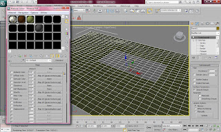
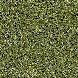
After I created the actual building of Hylands House I needed to create the beautiful parkland's which surround it. In order to create a field look I firstly made a large plane and highlighted the polygons that sit underneath the building. I then created a multi/sub-object material and on the first material I made grass which was a grass texture with a bump applied to it. I also created a concrete path as another sub-object to go around and underneath Hylands house.
I then wanted to add tree around the house as they are in the guide picture I have been using. I did this by simple used the object "foliage" to create different kinds of trees, once I had created one which was the right size compared to the building, I then duplicated it and clicked on "new seed" to create the same tree but in a different position.
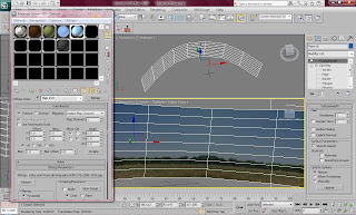
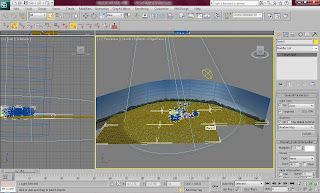
In order to create the sky I created a simple plane which I then curved into a half oval shape using the soft selection tool. This needed to be done so that no edges could be seen. I then made a material of a sky with trees on the bottom and then tiled it twice. This created a very good background.
The picture below shows the effect of the scenery and how good a few simple steps can make a model look. I would like to compare a picture of Hylands House with my model to make sure they are very similar. I will then need to add some lights to the scene and then I will be ready to animate and render.
Thursday, 18 November 2010
Hylands House - Chimneys and Doors
Next I had to create the details of the roof, which mainly consisted of a set of chimneys. These were very simple to create and very fun. Firstly I created a box with certain extruded parts and I then put four cylinders on top of the box. After applying the material, I put it in place and duplicated it in several other places.
This is the rendered version of the chimney which was duplicated. This looked very effective on the roof of Hylands House.
I then needed to create the last feature of the house which was very important because it will be used in the animation. This feature is the door. I made a flat box which I then reshaped to the size of the side door. I then created three other shapes to go around the door as small windows. This was made out of two boxes and half a sphere which has been flattened. The parts that formed the door were then duplicated an made bigger to produce the main doors.
This image shows the material used for the door. I used this because it was a preset for wood which allowed me to create the effect I wanted with two different blended colours.
Tuesday, 16 November 2010
Hylands House - Entrance
After making most of the details of Hylands House it was starting to look very effective. I next needed to make the front roof the building by making a box and pulling two of the top edges together. I then used the chamfer tool to make the edges look 3D. This was then put on top of a box and the align tool was used to make sure that it fit on top of the box well.
This is the rendered image of the two shapes put together. I also applied the material to the shape and made sure the square is slightly bigger than the square on the bottom.
After putting the shapes together and putting them in place on the building I had to put the columns underneath them. The original columns look slightly different to the columns on the front of the building. For this I extended them in length and equally aligned them under the two shapes. I also put two other squares on the entrance underneath the columns.
Monday, 15 November 2010
Hylands House - Symmetry Problems
After creating the detail on half of the main building, I deleted the polygons on the right hand side of the building in order to use the symmetry tool. However, when using the symmetry tool I came across many problems. When I selected the weld tool to make sure that the symmetry line welded together, it created many holes in the middle of the building in the shape of triangles. This was very frustrating and I had to ask my group for help at this point.
This is a rendered image of what my building looked like when I used the symmetry tool. This was very frustrating as I had not come across a problem like this before.
This problem was solved by getting rid of the symmetry tool and instead copying the left side of the building and using the mirror tool to make an exact replica of the left side on the right. I then welded each individual vertex because there was so much detail on the building.
Hylands House - Details and Materials
The house needed many different colours and materials applied to it as the building is mainly white but there are many other shaded colours in small parts of the house. For this a made a multi/sub-object material which allowed me to make several materials in one. I applied this material to all the parts of the building and made each colour of the building. The different parts were, roof: black, roof: grey, bricks: white, columns: moss green, windows: black, win sills: light yellow, columns, white. These seven colours helped to make the building look more realistic.
I then wanted to form the details of the building to make it look more like Hylands House at this stage. For this I used the columns I had previously made to place them in front of the first section of the building. I did this to know where the windows would could be placed and how big the columns need to be in comparison to the building. The windows were easy but confusing to make. Firstly i sections off the parts that I wanted to make black and made an extruded window sill which was set at a slight angle. I then used the chamfer tool to make the different panels of the window. The windows were slightly extruded inwards to make them look 3D.
This is a rendered version of the first section of the building so far. On the right hand side I have made a shaped gap in the building for a door to be placed. I made sure I duplicated the building before making the door gap because the other side of the building did not have the same details.
In order to make the details of the front of the building I found the image below to make sure I could see the details clearly as I wanted it to look exactly the same as the building.
I started by making the windows in the same way I did with the first section of the building. I made sure that I only created the details on the left side of the building because I knew it would be easier to use the symmetry tool to make the rest of the building. This would ensure that the building looks symmetrical on both sides to make it look more effective. The image below shows the rendered version of the details of half the building. Next I will be using the symmetry feature to make the building equally detailed.
Saturday, 13 November 2010
Hylands House - The roof and Columns
Next I decided to make the roof. This was a lot harder than it looked. As I have not used 3Ds max for a while I completely forgot the easiest way that I could make the shape of the roof. I eventually realised that a box would be the best option and then I used the extrude tool to lower the bottom of the roof. I also used the Chamfer tool to make the white edges on the roof.
I have used these tools many times before so this was all very easy to do. The picture below shows a rendered version of the roof. This shape would need to be duplicated to make the other smaller roofs.
The columns were lots harder than I first thought they would be. I used a simple cylinder and then used the extrude tool to make the bottom of the columns have a larger base. The columns were needed one many places on the building so I needed to create one and duplicate it eleven times. The feature at the top of the columns was made out of a simple flat box and two other cylinders.
Four of the duplicated eleven cylinders had to be slightly taller and thinner than the other columns but this has to be left for another time when I am more aware of the sizes that the columns need to be. The picture below shows a rendered version of the column.
Wednesday, 10 November 2010
Hylands House - The shape
My first scene that I wanted to make was a building which represented Chelmsford and that also contains lots of history. Hylands house is a very important building which is surrounded by Hylands park and tons scenery.
This building was built in 1730 for Sir John Comyns, who was MP for Maldon for many years, and Chief Baron of the Exchequer. Since then it has undergone many different stages of development to become the beautiful and elegant building it is today.
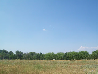
The picture below is the picture I used for reference to make sure that my model was like an exact replica of the real building. I wanted to make sure that people instantly know the building when the advert is viewed.
I started by making the middle section of the building by making a box and making the basic shape of the middle section. I made sure there was plenty of polygons on the building to make the complex shape of the building. I firstly constructed top parts which was like an alcove which ran all the way around the building.
This is a rendered image of the middle section of the building so far. This doesn't look very impressive so far, but there is plenty more work to do to the model. This model will need to be copied twice to form two smaller buildings either side of the middle section.
This building was built in 1730 for Sir John Comyns, who was MP for Maldon for many years, and Chief Baron of the Exchequer. Since then it has undergone many different stages of development to become the beautiful and elegant building it is today.
The picture below is the picture I used for reference to make sure that my model was like an exact replica of the real building. I wanted to make sure that people instantly know the building when the advert is viewed.
I started by making the middle section of the building by making a box and making the basic shape of the middle section. I made sure there was plenty of polygons on the building to make the complex shape of the building. I firstly constructed top parts which was like an alcove which ran all the way around the building.
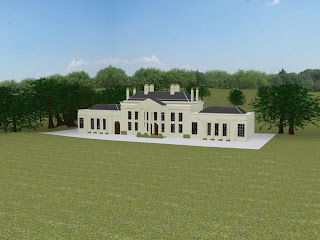
This is a rendered image of the middle section of the building so far. This doesn't look very impressive so far, but there is plenty more work to do to the model. This model will need to be copied twice to form two smaller buildings either side of the middle section.
Friday, 5 November 2010
Storyboard
After deciding on the places that I would be focusing on, I made a short storyboard to give me an idea of the views and camera movements and which sides of buildings would need to look most effective. This also gives me a good idea of where to put trees and how to arrange the planes for the grass and sky.
Wednesday, 3 November 2010
Planning
Before jumping into making some scenery I have to decide on exactly what I will be showing and how it will be displayed. I also need to make sure that design and transitions between scenes is similar to the parts that the girls in the group are designing.
The only way that I can make scenery look effective is to have walk through camera movements which scan around buildings and scenery in Essex. I have picked out a few building and scenery which are significant in Essex to give me an idea of what I can create in 3Ds Max. The buildings and scenery I have picked are listed below:
- Chelmsford Cathedral
- Naze Tower
- Hylands Park and Hylands House
- Colchester Castle
- Mountnessing Windmill
- St Johns Abbey Gate in Colchester
- Essex Coastline
- Epping Forest
- Audley End House and Gardens
- Hill Hall in Epping
- Ingatestone Hall
- Tilbury Fort
- Hadleigh Castle
- Cressing Temple
Subscribe to:
Posts (Atom)