This project has helped me in many ways for the future. I have learnt many things from being given this project and adopted many skills into my work. I also came across many problems, which in time helped me to also learn many new skills through working hard to solve the problems.
I faced many problems throughout this project and one of the main ones was the video export. When we was was making the original export individually, mine was the main project that was blurry and came out in very bad quality. I was not very happy with what was produced because I wanted to show off all my heard work and detailed modelling. We solved this problem by changing the settings of Premiere Pro. Another problem I came across many times was the "ignore backfacing" option which on many occasions I forgot to use. Hylands House also gave me many problems because of the complexity of the building. on many occasions it was stubborn and did not let me do what I was trying to achieve. Especially with the weld tool.
One of the main things that I have learnt throughout this project is to work effectively as a group. Many times over the project my group and I met up and helped each other out to produce an effective end result. Through the many discussions and problems we all faced we helped each other and put in 100% towards the end to make sure our video was improved and of the best quality we could make it in the time we had. Another thing I have learnt that isn't a big deal but I am very proud of, is that I was able to make a flag and animate it to make it look effective. I would not have been able to achieve this without the help of the tutorials. I also learnt many things about the program itself. I was unaware that 3Ds Max automatically saved your work in a folder continuously as you work on it. This means that if you make a mistake you can easily go back without saving your work every five minutes. This will come in very useful in the future. Another skill I learnt was how to make a beach. I have seen many effective rendered versions and always wanted to know how to achieve it. I am very impressed with my beach and the rippling of the water and I will definitely be using this skill again in the future. The camera flashing was also very new to me, as was the multiplier curve features to turn the flash on and off.
The skills that I have learnt throughout this project will help me now, whilst at University, and possible in the future, when working in the industry. I would like to go on further with 3Ds Max as I think there is much more to learn from this.
Thursday, 9 December 2010
Final Video
I am very impressed with how the final video looks. During the presentation it seemed almost impossible to be able to change and improve the video with the time we had. I also thought that the music might be very difficult to transition from all the way through but it worked very well. Many parts of the video could still do with some improvements and with all the time in the world I'm sure we would have been able to make it perfect. However, I very proud of what we have achieved in the space of time we had and I'm very glad to have been able to work as a group to create this video.
Individual Video
I am extremely impressed with the end result and my individual video in particular. I know we was working as a group but I would like to take the time to reflect on what I have achieved with my part of the video. After the presentation I understood how important feedback is and how it can significantly help you to realise many things that need changing. After the thorough changes that were made the video looked much more impressive and I was proud to show it off as my work.
This is the link to the video: http://www.youtube.com/watch?v=LzxYlZGW-WM
This is the link to the video: http://www.youtube.com/watch?v=LzxYlZGW-WM
Creating a New Video
Because of the mistakes we made last time and the little time we had to correct it, we made sure that we rendered the whole video as a group this time which took a while as many people were finished before other and it was very difficult to transfer all the files onto one computer. We managed to do it in the end and it look a few exports and changes to make the video perfect. Also, because we made the video all together we was able to make similar transitions which made the videos more in sync with each other.
Audio and Music
The group decided that each of us would pick our own audio for our part of the advert but we all agreed that any music put into it would need to be an instrumental version.
I decided to put ambient sounds in the background to make the audience feel more like they are apart of the scene and like they are there. I also wanted the audience to feel relaxed because that is how the scenery in Essex is meant to make people feel. I chose an ambient park sound with distant birds for the buildings and an ocean sound with sea gulls for the beach scene.
I decided to also add music to give the audience an added bit of excitement and enjoyment out of the advert. I chose the song "Better when were together" by Jack Johnson and found an instrumental version online. This song is very relaxing and chilled out which means it will help the mood for the audience.
Changes to Animation and Cameras
Firstly I wanted to create more animation around Hylands House instead of just a door opening. For this reason I put some people playing outside Hylands House. I created two stick men which would play frisbee outside of the building showing that Hylands House is surrounded by public parkland's. I made the animation by individually using the auto key for parts of the animation and setting certain events on particular key frames. I also had to make sure that they played with the frisbee in fast motion as I knew the video would eventually be slowed down.

I then made the other stick men take pictures outside the House showing that Hylands House is Historical and a must see. The camera action was the same animation that was used in Colchester castle by using a multiplier curve.

Because of these new animations I created a new camera path so that the camera zooms in on the people playing on the grass.

On Colchester Castle I added a moving flag to the building to make it more animated and engaging. This was done in the same way as the flag on the beach.
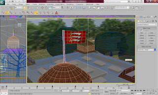
The camera movement of Colchester castle were very bland and boring. Because of this, I made a new camera route which scans from behind the castle and goes round to the flag to zoom in on he new animation added. This worked very well and made the whole thing look more interesting.


I then made the other stick men take pictures outside the House showing that Hylands House is Historical and a must see. The camera action was the same animation that was used in Colchester castle by using a multiplier curve.

Because of these new animations I created a new camera path so that the camera zooms in on the people playing on the grass.

On Colchester Castle I added a moving flag to the building to make it more animated and engaging. This was done in the same way as the flag on the beach.

The camera movement of Colchester castle were very bland and boring. Because of this, I made a new camera route which scans from behind the castle and goes round to the flag to zoom in on he new animation added. This worked very well and made the whole thing look more interesting.

Changes to Scenery
After the presentation, I wanted to make changes to the beach scene to make it more interesting and have more animation. Firstly I created a few simple beach huts out of the box shapes. These looked very effective and were very fun to make as the doors all have different colours.
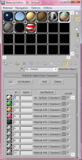
This is the material for the beach huts. I used the same texture and changed the colour of the original texture several times in photoshop. This was fun because I was able to pick whatever colours I wanted and experiment.
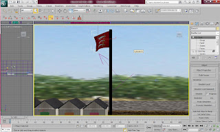
I then made a flag to add some more animation to the beach. The flag was the very new to me because I have never animated anything like this before so I had no idea of how to go about it. I looked up a few tutorials online and found out how to make a basic flag move. Firstly I created the flag and gave it a cloth modifier. I then applied the cloth to the flag material and set the vertexes which would be attached to the pole, which was set as the node. I then made a wind feature and applied it to the flag which made the flag move efficiently as if it was blown by wind. I then clicked on simulate and it automatically made all the key frames for me.

This is a render of the finished beach huts and flag. I am very impressed with it at this stage as it is a big improvement from what was shown on the scene before.


This is the material for the beach huts. I used the same texture and changed the colour of the original texture several times in photoshop. This was fun because I was able to pick whatever colours I wanted and experiment.

I then made a flag to add some more animation to the beach. The flag was the very new to me because I have never animated anything like this before so I had no idea of how to go about it. I looked up a few tutorials online and found out how to make a basic flag move. Firstly I created the flag and gave it a cloth modifier. I then applied the cloth to the flag material and set the vertexes which would be attached to the pole, which was set as the node. I then made a wind feature and applied it to the flag which made the flag move efficiently as if it was blown by wind. I then clicked on simulate and it automatically made all the key frames for me.

This is a render of the finished beach huts and flag. I am very impressed with it at this stage as it is a big improvement from what was shown on the scene before.

Introductions
The Introductions for the advert needed to be made to be associated with Essex so I put together some short clips to introduce each of the sections. The website and "Visit Essex" also needed to be displayed as well so I made an ending clip which gives people the information about the video.
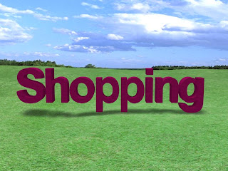
I decided to have the writing sitting in a field and use the groups original idea of zooming into the writing and fade out. The field was made out of two planes with materials applied to them. I then made the grass plane an editable poly and raised small areas of the grass to make hills.
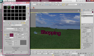
These are the materials used for the Introduction. I made a grass texture and a detailed sky texture.
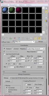
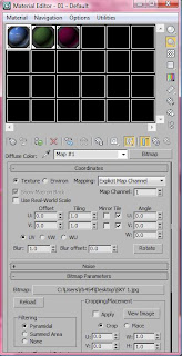
The rendered images look very effective. To make the final clip of the Visit Essex look slightly different from the rest, I changed the writing to make it look more effective by sitting each letter on the hills.

This is the link to the video: http://www.youtube.com/watch?v=EMwGoNFfu-4
I decided to have the writing sitting in a field and use the groups original idea of zooming into the writing and fade out. The field was made out of two planes with materials applied to them. I then made the grass plane an editable poly and raised small areas of the grass to make hills.

These are the materials used for the Introduction. I made a grass texture and a detailed sky texture.


The rendered images look very effective. To make the final clip of the Visit Essex look slightly different from the rest, I changed the writing to make it look more effective by sitting each letter on the hills.


This is the link to the video: http://www.youtube.com/watch?v=EMwGoNFfu-4
Presentation
The presentation did not go as planned at all. With a little bit more time we would have been able to improve the presentation lots. There are many things that I would have changed about the presentation if we had a second chance. One would be to add audio to the video as it was extremely ineffective without any sound. However, from doing the presentation at the stage that we did, we had a big benefit from not being finished and being given the opportunity to make improvements.
Some of the improvements that I could make were:
Some of the improvements that I could make were:
- Make the whole advert shorter by cutting out scenes.
- Include the website somewhere in the advert.
- Add more animation to the scenery scenes.
- Add audio to the advert throughout.
- Add writing to introduce the places in Essex.
- Add “Visit Essex” at the end.
- Create new introductions to each section of the advert.
- Make the individual renders faster.
- Add music to each section.
Creating Video
We decided to all make our own videos and then put them into one premiere pro project. This was a very bad idea as we came across many problems doing this. We only had one day to put our video together for the presentation so we rushed the video exporting which lead to many problems and bad decisions.
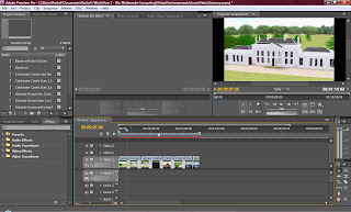
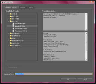
One of the main problems we came across was that we all had premiere pro set to different settings. On the start up screen the sequence was meant to be set the "DV-PAL" and "Standard". Because of this all of our videos were exported at different sizes which made the video look even worse.
The scene order was worked out very easily. I wanted the scenes to focus on one building at a time and go into one door of Hylands House and out of the door of Colchester castle. I also wanted all the other scenes to have the transition fade to black which made it look more effective.

One of the main problems we came across was that we all had premiere pro set to different settings. On the start up screen the sequence was meant to be set the "DV-PAL" and "Standard". Because of this all of our videos were exported at different sizes which made the video look even worse.

The scene order was worked out very easily. I wanted the scenes to focus on one building at a time and go into one door of Hylands House and out of the door of Colchester castle. I also wanted all the other scenes to have the transition fade to black which made it look more effective.
Rendering
The rendering process was quicker than I expected it. For usual animations, I would need to get up the rendering for a couple of days and renders would take a minimum of 8 hours. On this occasion the animation were extremely quick. I was able to do most of the animations within an hour. This was very impressive for me because it allowed me to know that I would be able to make edits if the render did not come out the way I planned.
Animations
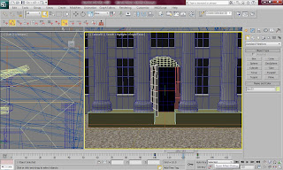
After making the camera path to go into the doors of Hylands House, I needed to make the animation of the door opening. This was very easy because all I needed to do was used the auto key tool and open the door on a pivot. This looked very effective when it had finished. The image below shows the key frames for this animation.
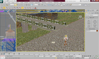
I then wanted to create a small animation in front of Colchester Castle as it does not have any doors to open. I decided to create a small tourist in front of the Castle to make it seem more appealing. I tried on several occasions to make the little man walk past the castle but I had many problems with skinning and the feature on my version of the program. This held me back a lot and forced me to give up on the idea of the man walking. Instead I looked into how I could make the man take a picture of the Castle like the average tourist. This was quite difficult to do as the man did not want to do anything I asked it to do.
Firstly I set a small animation of the man raising his arms and pulling a small black box (the camera) to his face. This was difficult as the arms went all over the place when I set the simple animation. I solved this problem by grouping the whole arms structure and then animated the shoulders.
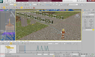
I then animated the camera making a small flash. This was not very simple to do as I did not know how to do this at all. Firstly I made a small target light from the front of the camera to the castle. I managed to find out that I needed to add a multiplier curve and then edit it so that it appeared on the frames that I set it as. The picture below shows how I did this.
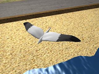
After, I needed to animate the beach. The one thing that you always see at the beach is sea gulls. I decided to animate a sea gull flying through the sky in front of the camera. This was very simple to do, as was making the actual sea gull. It was made through simple uses of shapes and a multi/sub-object material. I did not want to put any details on the sea gull because the user would only see it for two seconds.

I then wanted to create a small animation in front of Colchester Castle as it does not have any doors to open. I decided to create a small tourist in front of the Castle to make it seem more appealing. I tried on several occasions to make the little man walk past the castle but I had many problems with skinning and the feature on my version of the program. This held me back a lot and forced me to give up on the idea of the man walking. Instead I looked into how I could make the man take a picture of the Castle like the average tourist. This was quite difficult to do as the man did not want to do anything I asked it to do.
Firstly I set a small animation of the man raising his arms and pulling a small black box (the camera) to his face. This was difficult as the arms went all over the place when I set the simple animation. I solved this problem by grouping the whole arms structure and then animated the shoulders.

I then animated the camera making a small flash. This was not very simple to do as I did not know how to do this at all. Firstly I made a small target light from the front of the camera to the castle. I managed to find out that I needed to add a multiplier curve and then edit it so that it appeared on the frames that I set it as. The picture below shows how I did this.

After, I needed to animate the beach. The one thing that you always see at the beach is sea gulls. I decided to animate a sea gull flying through the sky in front of the camera. This was very simple to do, as was making the actual sea gull. It was made through simple uses of shapes and a multi/sub-object material. I did not want to put any details on the sea gull because the user would only see it for two seconds.

Wednesday, 8 December 2010
Cameras
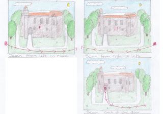
For the cameras I wanted to have basic camera scans of the buildings to show off their building and make people wonder about their heritage and history. The first camera scan that I decided to do was the Hylands House camera scan. From the plans I made, shown below, I can see that I wanted two scans around the building and one scan going into the doors of the House.
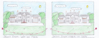
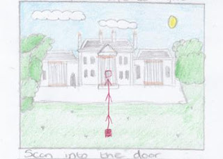
I did this by firstly placing a target camera onto the scene and aiming the target into the middle of the house. I then created a line in the top view in a slightly curved pattern. I then clicked on the camera and changed the movement features by applying a path constraint and adding the line as the path. By doing this, it automatically created key frames where the camera moves from one side of the line to the other.
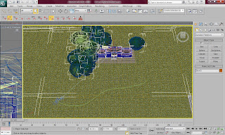
I was very impressed by this way of creating a pathway for the camera. I decided to use the same concept with Colchester Castle except this time the camera would come down from the sky and scan across the castle. I thought this movement was very effective.
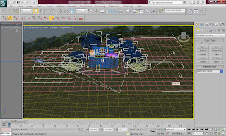
This is the view in 3Ds Max of the camera and the lines around Colchester Castle. I was also able to see what the camera would be facing by going into camera view and sliding the bar along the frames while the view showed what the camera would be facing as it moved.
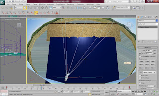
The beach scene was the easiest part to do. However, because a cylinder was surrounding the scene, I had to be careful that the camera did not disappear behind the shape.
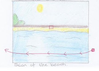
The camera in the beach scene made the ocean look very effective. The image below shows the route of the camera and where it was facing within the scene.


I did this by firstly placing a target camera onto the scene and aiming the target into the middle of the house. I then created a line in the top view in a slightly curved pattern. I then clicked on the camera and changed the movement features by applying a path constraint and adding the line as the path. By doing this, it automatically created key frames where the camera moves from one side of the line to the other.

I was very impressed by this way of creating a pathway for the camera. I decided to use the same concept with Colchester Castle except this time the camera would come down from the sky and scan across the castle. I thought this movement was very effective.

This is the view in 3Ds Max of the camera and the lines around Colchester Castle. I was also able to see what the camera would be facing by going into camera view and sliding the bar along the frames while the view showed what the camera would be facing as it moved.

The beach scene was the easiest part to do. However, because a cylinder was surrounding the scene, I had to be careful that the camera did not disappear behind the shape.

The camera in the beach scene made the ocean look very effective. The image below shows the route of the camera and where it was facing within the scene.

Monday, 6 December 2010
Essex Coastline - Sand and Wall
After I needed to add the sand to the scene which was very basic. I simply created a long plane and set it at a slight angle going down towards the ocean. I then applied a material to it which a bitmap of a sand texture which also had a slight bump map applied to it.
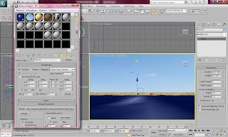
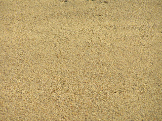
This is the rendered image of the beach scene with sand. I think that so far this looks very effective. However, something needs to be added behind to sand to make it look more like a beach and less like an island.
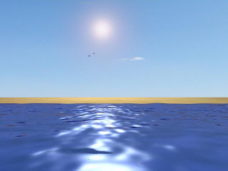
For this reason I added a wall and lifted the sky to show some bushes. The wall was given the same material and texture as Colchester castle as this looked very effective. All the planes were set to be very long in width and very short in height to give the illusion of distance of the camera.

This is a rendered image of the final scene. I am very happy with the final image as it was a very easy to make but effective scene. I had to be quick with this scene as I did not have much time before the presentation to make a detailed scene, but I will be able to make this better when I make changes.
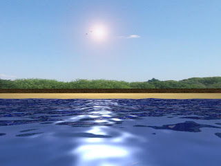


This is the rendered image of the beach scene with sand. I think that so far this looks very effective. However, something needs to be added behind to sand to make it look more like a beach and less like an island.

For this reason I added a wall and lifted the sky to show some bushes. The wall was given the same material and texture as Colchester castle as this looked very effective. All the planes were set to be very long in width and very short in height to give the illusion of distance of the camera.

This is a rendered image of the final scene. I am very happy with the final image as it was a very easy to make but effective scene. I had to be quick with this scene as I did not have much time before the presentation to make a detailed scene, but I will be able to make this better when I make changes.

Essex Coastline - Sky and Sun/Lighting
Next I needed to make the sky which was very easy to do as I had done this for both the other scenes. This time I placed the material onto a cylinder to make sure no corners were shown in the render as it's only a small scene.
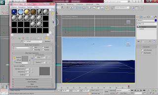
I then had to place a light in the scene to represent the sun as well as the reflection on the water. I made an omni light for this and set it in the right place in the scene. I then set the multiplier to 0.8 and added a lens effect and set up a glow to make the effect of the sunlight. This set a really effective reflection on the ocean.
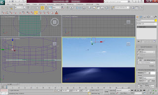
This is a rendered image of the beach scene so far. I am very impressed with the way this looks as I did not think I would be able to create this scene as quickly as I have been able to and as effectively as I have been able to.


I then had to place a light in the scene to represent the sun as well as the reflection on the water. I made an omni light for this and set it in the right place in the scene. I then set the multiplier to 0.8 and added a lens effect and set up a glow to make the effect of the sunlight. This set a really effective reflection on the ocean.

This is a rendered image of the beach scene so far. I am very impressed with the way this looks as I did not think I would be able to create this scene as quickly as I have been able to and as effectively as I have been able to.

Saturday, 4 December 2010
Essex Coastline - The Ocean
After I had created two separate scenes for representing scenery in the Essex advert I knew this would not be enough to show the different kinds of scenery around. One of the specifically different types of scenery in Essex is the coastline. Most of Essex is surrounded by beautiful beaches and coastlines so I thought that it would be the perfect thing to show in an advert.
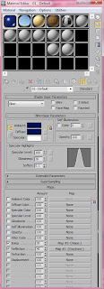
For the ocean I had a rough idea of how to make it. I knew that water can be made to look very effective because I have seen it in many other animations. So, I looked around on the Internet and found a very good and easy tutorial for making an ocean. The tutorial I used to help me with this is shown below:
http://www.youtube.com/watch?v=tE44k7d_FtI&feature=related
I created the sea by firstly making a plane and applying a specific material to it. The tutorial took me through the many features which could help me make a very effective ocean. I chose a deep blue as the colour of the ocean because the water in Essex is very dark.
I then used the phase feature along with auto key to create a timeline of the phase of the material increasing which meant I was able to create a rippling water effect.

Friday, 3 December 2010
Colchester Castle - Lighting
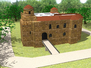
The lighting was set up last of all for Colchester Castle and it made the castle look very realistic and effective. I set up the lighting the same way that I did for Hylands House. I firstly set up a skylight with a multiplier on 0.79 and I then Set up a target light opposite the skylight set at 0.5 with the shadow feature set on. I am very impressed with the way this made the scene look very effective and come alive. The image below shows a rendered version of the scene.

Colchester Castle - Scenery
The ground around Colchester Castle was very fun to make as I was able to experiment with the path around the castle. Firstly I made a large plane and placed the castle in the middle. I then made the plane an editable poly and made the plane look more like an uneven ground. Underneath the castle the ground dips largely so I made sure this looked effective. I then made a multi/sub-object material which was two different textures, one of grass and the other concrete. I played about with the tiling feature until they looked right. I also edited the vertexes around the castle to create a curving path and edited the polygons to show concrete instead of grass. I thought it also might look effective if I raised the path slightly.
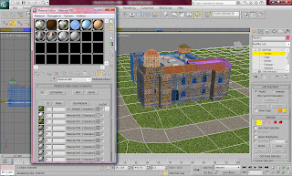
These are the material textures that I found on the Internet for the ground around the castle.

After I applied the material I realised that the building looked very unrealistic as all the materials looked very animated. To solve this I individually changed the textures in Photoshop to look more realistic. I changed the roof to make it darker to look dirty and old. I also changed the grass to make it look darker to achieve a more rustic and realistic effect. The bricks also needed darkening to make the building look old and the tiling needed to be sorted to make the texture able to be tiled without looking odd.


After I made the material for the ground sorted I began to make the bridge which would lead people to the doors of the castle. This was very simple to make as it only consisted of a flat box set at an angle and and given the same material as the path on the ground. I then made the gates that appeared on their side of the bridge. This was simple because I was able to create one part of the gate and duplicate it across the whole length of the bridge.
I then had to focus on the trees surrounding the castle. This was easy as I have had experience with the trees during the process of Hylands House. I placed a few around the building but I made sure that there was not too many so that I did not take the focus away from the building and to make sure the rendering time would be as quick as possible.
I then made the sky which was also very easy to make as I duplicated the sky that was used around Hylands House. I wanted to keep the same sky so that the sky looked the same brightness and similar in each scene.


These are the material textures that I found on the Internet for the ground around the castle.

After I applied the material I realised that the building looked very unrealistic as all the materials looked very animated. To solve this I individually changed the textures in Photoshop to look more realistic. I changed the roof to make it darker to look dirty and old. I also changed the grass to make it look darker to achieve a more rustic and realistic effect. The bricks also needed darkening to make the building look old and the tiling needed to be sorted to make the texture able to be tiled without looking odd.


After I made the material for the ground sorted I began to make the bridge which would lead people to the doors of the castle. This was very simple to make as it only consisted of a flat box set at an angle and and given the same material as the path on the ground. I then made the gates that appeared on their side of the bridge. This was simple because I was able to create one part of the gate and duplicate it across the whole length of the bridge.
I then had to focus on the trees surrounding the castle. This was easy as I have had experience with the trees during the process of Hylands House. I placed a few around the building but I made sure that there was not too many so that I did not take the focus away from the building and to make sure the rendering time would be as quick as possible.
I then made the sky which was also very easy to make as I duplicated the sky that was used around Hylands House. I wanted to keep the same sky so that the sky looked the same brightness and similar in each scene.

Wednesday, 1 December 2010
Colchester Castle - Roof Material
The roof consisted of many different shapes and styles. The first material I made was the glass roof inside the cylinder shape part of the building. This was very easy to do. I made the frame around the glass white and I made the clear glass grey. This was done by creating two different colours on a multi/sub-object material.
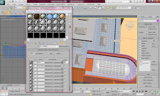
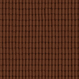
I then made a roof material by finding a roof texture on the Internet and applying it to certain parts of the roof. Once there I used the tile feature to make sure it was placed in the right place and looked right. I did this to all the parts of the roof. I also applied a bump map to make the roof look slightly bumpy.

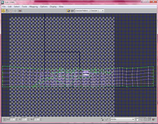
The part of the roof that was most difficult to do was the curved part of the roof. For this I had to use the Unwrap UVW modifier which allowed me to unwrap all the material vertexes to make sure the material sat on the shape fine. The picture below shows how I unwrapped the vertexes and what the UVW map looked like once I had finished with it. This was not an easy task as I had to work out which way the vertexes needed to go and then try manipulating it to form the right shape.
This is a rendered image of the roof after I applied the material to it and used to UVW map to make sure it fit on properly around the curved areas and borders. I am very impressed with the way this turned out because I looks like the right colour as well as style.


I then made a roof material by finding a roof texture on the Internet and applying it to certain parts of the roof. Once there I used the tile feature to make sure it was placed in the right place and looked right. I did this to all the parts of the roof. I also applied a bump map to make the roof look slightly bumpy.


The part of the roof that was most difficult to do was the curved part of the roof. For this I had to use the Unwrap UVW modifier which allowed me to unwrap all the material vertexes to make sure the material sat on the shape fine. The picture below shows how I unwrapped the vertexes and what the UVW map looked like once I had finished with it. This was not an easy task as I had to work out which way the vertexes needed to go and then try manipulating it to form the right shape.

This is a rendered image of the roof after I applied the material to it and used to UVW map to make sure it fit on properly around the curved areas and borders. I am very impressed with the way this turned out because I looks like the right colour as well as style.

Subscribe to:
Posts (Atom)