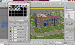
These are the material textures that I found on the Internet for the ground around the castle.

After I applied the material I realised that the building looked very unrealistic as all the materials looked very animated. To solve this I individually changed the textures in Photoshop to look more realistic. I changed the roof to make it darker to look dirty and old. I also changed the grass to make it look darker to achieve a more rustic and realistic effect. The bricks also needed darkening to make the building look old and the tiling needed to be sorted to make the texture able to be tiled without looking odd.


After I made the material for the ground sorted I began to make the bridge which would lead people to the doors of the castle. This was very simple to make as it only consisted of a flat box set at an angle and and given the same material as the path on the ground. I then made the gates that appeared on their side of the bridge. This was simple because I was able to create one part of the gate and duplicate it across the whole length of the bridge.
I then had to focus on the trees surrounding the castle. This was easy as I have had experience with the trees during the process of Hylands House. I placed a few around the building but I made sure that there was not too many so that I did not take the focus away from the building and to make sure the rendering time would be as quick as possible.
I then made the sky which was also very easy to make as I duplicated the sky that was used around Hylands House. I wanted to keep the same sky so that the sky looked the same brightness and similar in each scene.

No comments:
Post a Comment